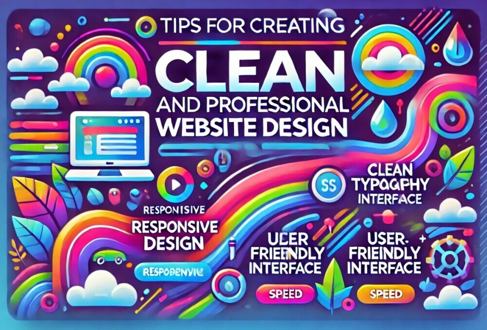
A clean and professional design on an affiliate website is more than just eye-catching. It’s this blend of aesthetics and functionality that makes users feel comfortable and confident about your content. Think of it as creating a space that’s welcoming and easy to navigate without any of those annoying pop-ups or clutter that scream for attention.
Simplicity plays a huge role here. You want visitors to find what they’re looking for without breaking a sweat. Effective design means your site isn’t just good-looking; it’s easy to move around, with intuitive menus and helpful navigation cues. Nothing should feel out of place or overwhelming.
Trust and credibility often stem from first impressions. If your website looks thrown together, users might question the professionalism and reliability of your content. A professional design speaks to your legitimacy and can indirectly influence their willingness to engage with suggested products or services.
How your website looks can impact how users feel while they’re browsing. Pleasant aesthetics soothe and can lead to longer visits, lowering bounce rates, and boosting conversion chances. From color scheme to layout, every small detail can tip the scales toward a positive or negative user experience.
The Role of User Experience (UX) in Website Design
User Experience, or UX, is all about making every interaction on your site smooth and enjoyable. In the world of affiliate marketing, a top-notch UX can be the game changer. It transcends basic design elements, diving deep into how your visitors perceive and interact with your site.
Key UX elements that really elevate a clean and professional design include straightforward navigation, clear content layout, and quick load times. Imagine your affiliate site as a friendly guide, helping users find what they need without fuss. Everything should be where your visitors expect it, reducing any confusion that could lead them to bounce off.
Designing an intuitive and user-friendly interface requires empathy. Put yourself in your users’ shoes to anticipate their needs. It’s about walking a mile in their shoes and figuring out what will make their experience as seamless as possible. A well-thought-out site map, easy-to-use search functions, and organized content sections can do wonders here.
Good UX design doesn’t just reel people in – it keeps them hanging around. Users who find your website easy and pleasant to use are more likely to stay longer, explore further, and, hopefully, click on those affiliate links. Engaged users are an affiliate marketer’s best friend, after all.
Creating a great UX goes beyond the surface. It’s about engaging users and ensuring their journey through your site is as frictionless as possible. With these thoughtful design details, you create an environment where users feel understood and valued.
Practical Tips and Best Practices for Affiliate Website Design
Getting your affiliate website design right is like setting the stage for a great user experience. Cleanliness and professionalism aren’t just buzzwords—they’re your guiding principles.
One critical aspect is to stick to a clutter-free approach. Prioritize essential content and features, keeping distractions like unnecessary widgets or flashy graphics to a minimum. Simplicity should be your mantra.
Mobile responsiveness is no longer optional. With so many users accessing sites via smartphones and tablets, a responsive design ensures your website looks and functions flawlessly across all devices. Nobody wants to pinch and zoom to read on a tiny screen!
Speed has become a major player in the design game. Users are impatient. Optimizing your site to load quickly not only improves user experience but can also positively impact your site’s search engine performance.
Color schemes and typography might seem like minor details, but choosing the right ones can create a harmonious look and feel. Stick to a cohesive color palette and pair it with readable fonts to maintain aesthetic appeal without compromising clarity.
Whitespace isn’t just empty space; it’s an essential design element. Using whitespace effectively can help delineate sections, direct user attention, and give your overall design a clean, uncluttered look.
Incorporating Trust Signals and Call-to-Actions
Trust signals are like friendly nods that let users know your site is credible and reliable. These could be badging, logos of familiar brands, SSL certificates, or anything that quietly whispers, ‘You’re in safe hands.’ Making these prominent can help reassure visitors that they’re dealing with a legitimate site.
Strategically placed call-to-action (CTA) buttons can be powerful tools in guiding users towards making decisions like clicking a link or purchasing a product. Make these buttons stand out without being intrusive—bright colors often work well but stick within your color scheme.
Effective trust elements go beyond security symbols. Think customer testimonials, product ratings, and even user reviews. Real feedback from real people can do wonders in tipping the scales in favor of those clicks and conversions you’re after.
Social proof isn’t just a buzzword. Showcasing your social media presence, follower counts, or even Twitter mentions helps affirm your site’s active engagement with users. It’s about creating that buzz that tells your audience others have found value here, and they will, too.
Please feel free to leave a comment or a question before you read on.
To learn more about me, you can read this article.
If you want to create a well-designed website with engaging content that is easily created using a proprietary AI writer, you can visit this link. My assumption is that you are here because you want an online business.
If you already have a niche (an area of interest that you are passionate about and want to share with others and get paid to do so), then you are well on your way!

